I mentioned that I would try to write a blog article about some of my painting process, and I’m going to attempt it here. A lot of artists think of things like this as trade secrets, but I really don’t care about showing people how the sausage is made.
The thing is, I have a different process for every different type of media I use, and frankly for every painting I make. After much thought about this, I realized that I don’t do much of anything “rote.” It all depends. Just like everything in life, right?
Watercolors usually, not always, start with a pencil sketch. As boring as this may or may not read, I’m going to keep on talking…
Let’s take this one I did this past summer. It’s called, “Stone’s Throw.” (22.3 x 30 inches.)
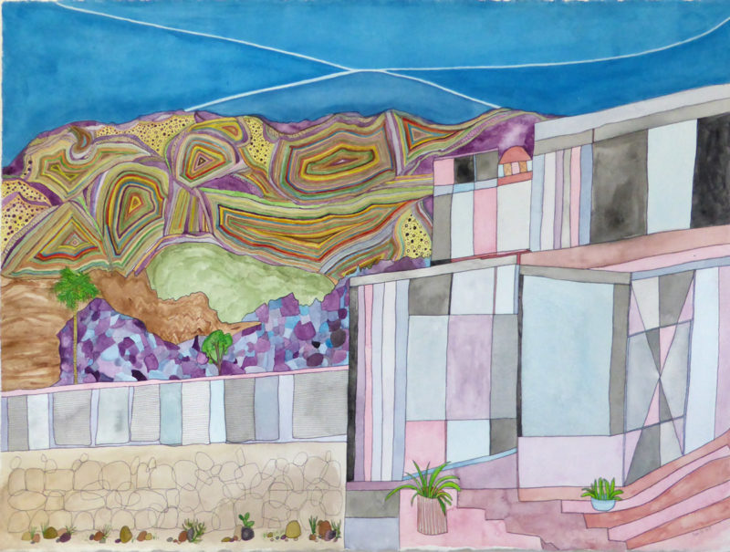
The concept was a glass-like house in the middle of the desert. It’s from a quick sketch I made a long time ago that later became a decision to make as a watercolor. It could have just as well become an oil painting, which would have then become an entirely different process for sure, but that’s another story. I’ll probably post another process entry about an oil painting too. Maybe.

So, I don’t usually use any special kind of paper when making a quick sketch. I grab the most convenient thing available, which is a piece of paper sitting there, right out of my inkjet printer. Some “arteest,” eh? I don’t start getting snobby about my materials until later, then, there’s no cost too large for the best of the best.
This sketch was scanned right into Photoshop, and as you might see, it was enhanced a bit with Brightness, and Contrast. I do this so I can play with color schemes right on the computer. If all the little dirt spots showed, I wouldn’t be able to use the Magic Wand to select the areas between lines and color them in.
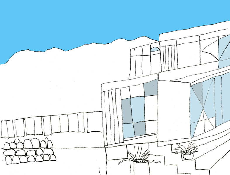
Once I made a basic decision on the colors I had a pretty good idear about how I wanted to paint this thing, I re-sketched the composition onto a 23 x 30 inch piece of 300 lb. Fabriano Artistico cold pressed watercolor paper. I prefer the cold press (smooth) to the hot press (rough). I also like Arches, which might be almost a dollar more expensive, but they are both expensive, same cotton, same quality, and weight. I have both types of paper in my arsenal and I happened to grab a Fabriano for this.
I start painting using professional Holbein watercolor paints with various brushes. I use a lot of different kinds and they range from crazy expensive to middle-priced synthetic. I have a select few favorites, if you care.
The most used brushes are small, round double and triple zero Sterling Studio white synthetics. I have a million of em so whenever they lose their shape, I have another one handy. Most of the others are Princeton Sables. I have one other 16 round I use for free lines, a quarter inch angle shader, a 1.5-inch angular wash, and a 2-inch Neptune synthetic squirrel mottler, which may be one of my most expensive brushes, but it’s how I get those blends on my skies. Those are priced around $70, but you can get them for half that at Blick.
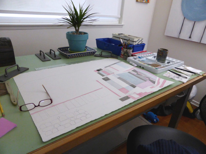
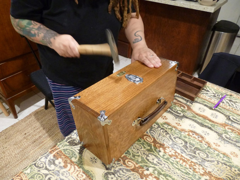
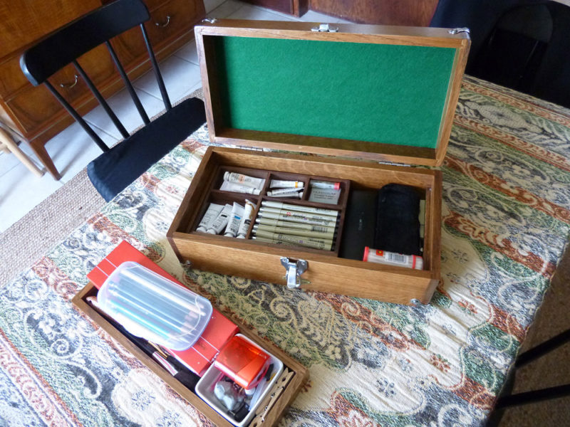
I started this painting before I got interrupted and started working on pieces for my solo show, so this was before mjp and I built this beautiful watercolor box:
Once I got back to the painting, I’d already moved to Joshua Tree and picked up where I left off.

At this point in time (above), I did not know I was going to do this with the mountain range. It just sort of happened. Once I started it this way (I sectioned it off with the purples first), I felt like I had to keep it going. I’d originally planned on this basic color scheme, but all the thin lines were going to be falling in a downward pattern, not spiraling inward.

Much of the time, I don’t know what things are in my work because some stuff is strictly imaginary. I have vague ideas about them. For instance, these vertical rectangles that spread out to the left of the house could be anything. Anything you want them to be. I figure they could suggest they’re maybe a part of the house, a hallway, a fence, solar panels, a catwalk made of glass…does it matter? It can. It doesn’t. Whatever.
I’m not sure if that last pic is a complete “done,” because I took the shot and marked it as a progress pic. There might be outlines that weren’t complete when I took it. In any case, when I’m done with all the painting, I use Sakura Micron felt pens to outline every pencil line. I specifically use them because–trade secret–I can erase all the pencil lines afterward and that ink will not smudge or lighten. It will stay very dark black. I use a Gum eraser to erase the pencil–very important for using this technique. And a softer B-pencil is better/easier to erase. H-pencil lines are almost impossible to hide. You also have to wait until the ink is completely dry or else it will smudge. I wait an hour sometimes to be totally safe–because I’m crazy.
I do the sky last, and that’s just about in every landscape. Not always, but most of the time. This sky originally had one white line (the upper line), but it wasn’t exciting enough for me. No, I couldn’t just leave it. I had to split the sections because the mountain range was split off into sections, and so I felt it needed it. I added the bottom white line to divide the four sections in that X-like pattern and started to shade the blues, making ever so subtle differences.
The little rocks in the foreground were an afterthought, but I like em. The interlinking hollow rocks weren’t going to interlink in the first place, but I decided to do that once most of the painting was finished.
I go through a lot of cans of Krylon Low-odor Clear Finnish (matte) to fix the paintings, just a light spray about a foot and a half away from the paper. I go through a lot of cans of this because, after the first few uses of the thing, the can gets a bit clogged and will not spray evenly. It will spurt tiny little droplets with the spray. And when those little dots get on the painting, you can see them, and that’s just not fair! That’s some bullshit is what that is. So I’m usually left with a half a can that’s no good, even if I try to clean the hell out of the nozzle.
So…too many details? I think not!
Until next time.